
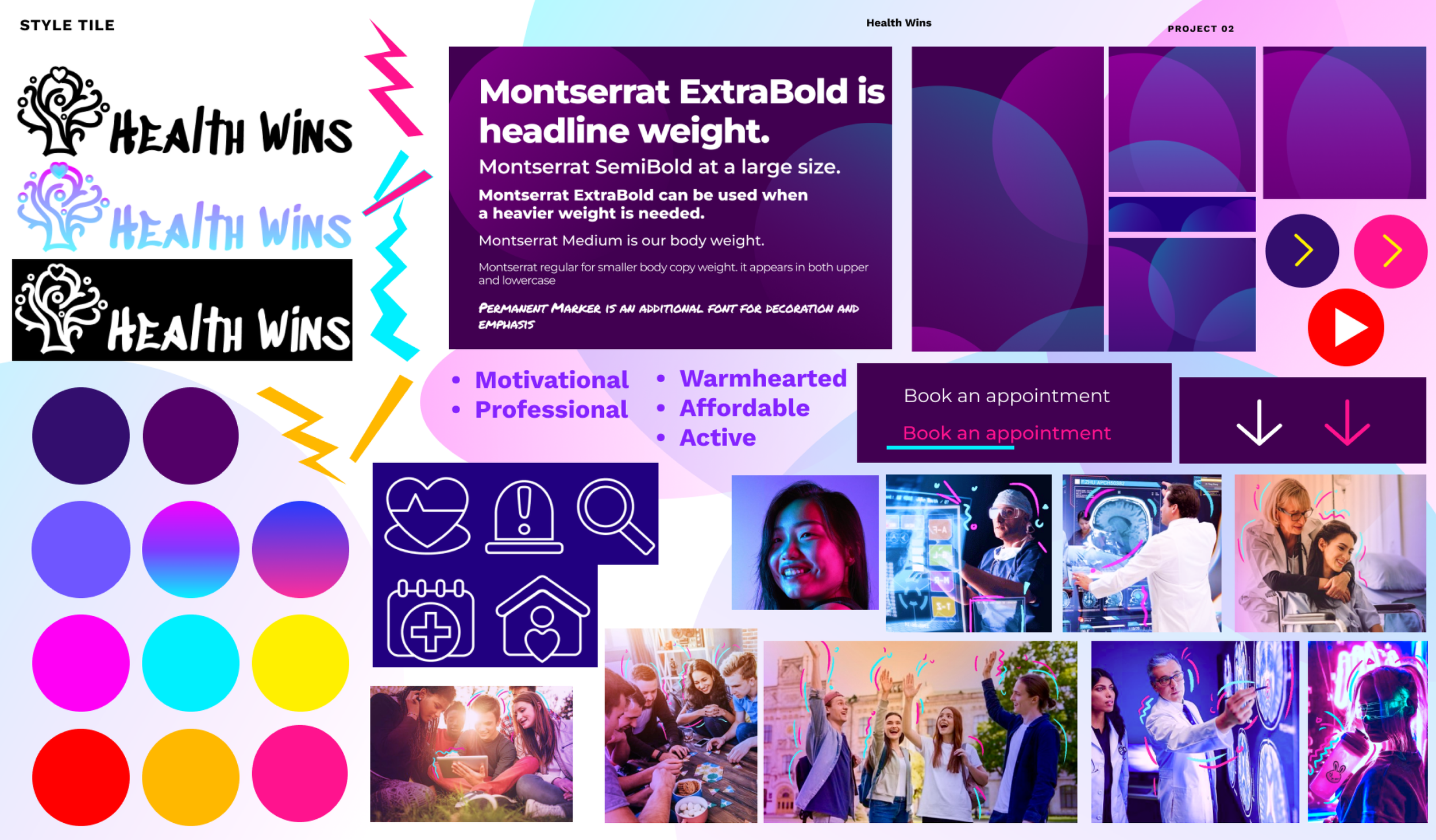
Health Wins

Health Wins prioritizes the well-being of its members by offering personalized and affordable healthcare services tailored specifically to college students, with a focus on health coaching to help them achieve their goals and maintain healthy lifestyles.
Health Wins
SKILLS
Branding
Competitive Analysis
Wireframing
Prototyping
Style Guide
UI/UX Design
Icon Design
TOOLS
Figma
Procreate
Photoshop
PROJECT DURATION
Nov 2022 - Sep 2022
This project showcases the process of creating a new and unique brand from scratch. It encompasses initial competitive analysis, target customer research, as well as the development of the brand's overall tone, design style, and philosophy.
The greatest challenge of this project lies in distinguishing the brand within a competitive market, attracting our target demographic, and maintaining consistency in the brand's style and image.
Introduction
About Health Wins
Health Wins’s big idea is healthcare that's always within reach and guided by Inspiring, Approachable, Protecting, Being the resource, and Building trust.
Motivational
Professional
Warmhearted
Affordable
Active
Brand Personality

The brand was designed for college students(Aged 18-24), it was important that to reflect the brand's personality and big idea while also letting the audience feel motivated and strategies provided to overcome their fears and to achieve optimal health, and professionalism of the brand.


Design Process

Competitive Analysis

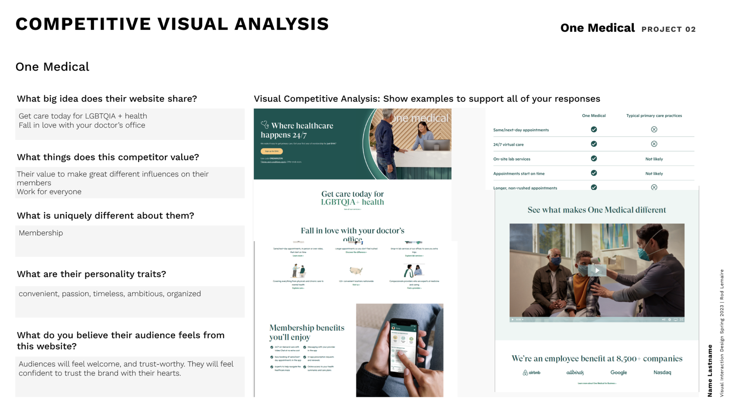
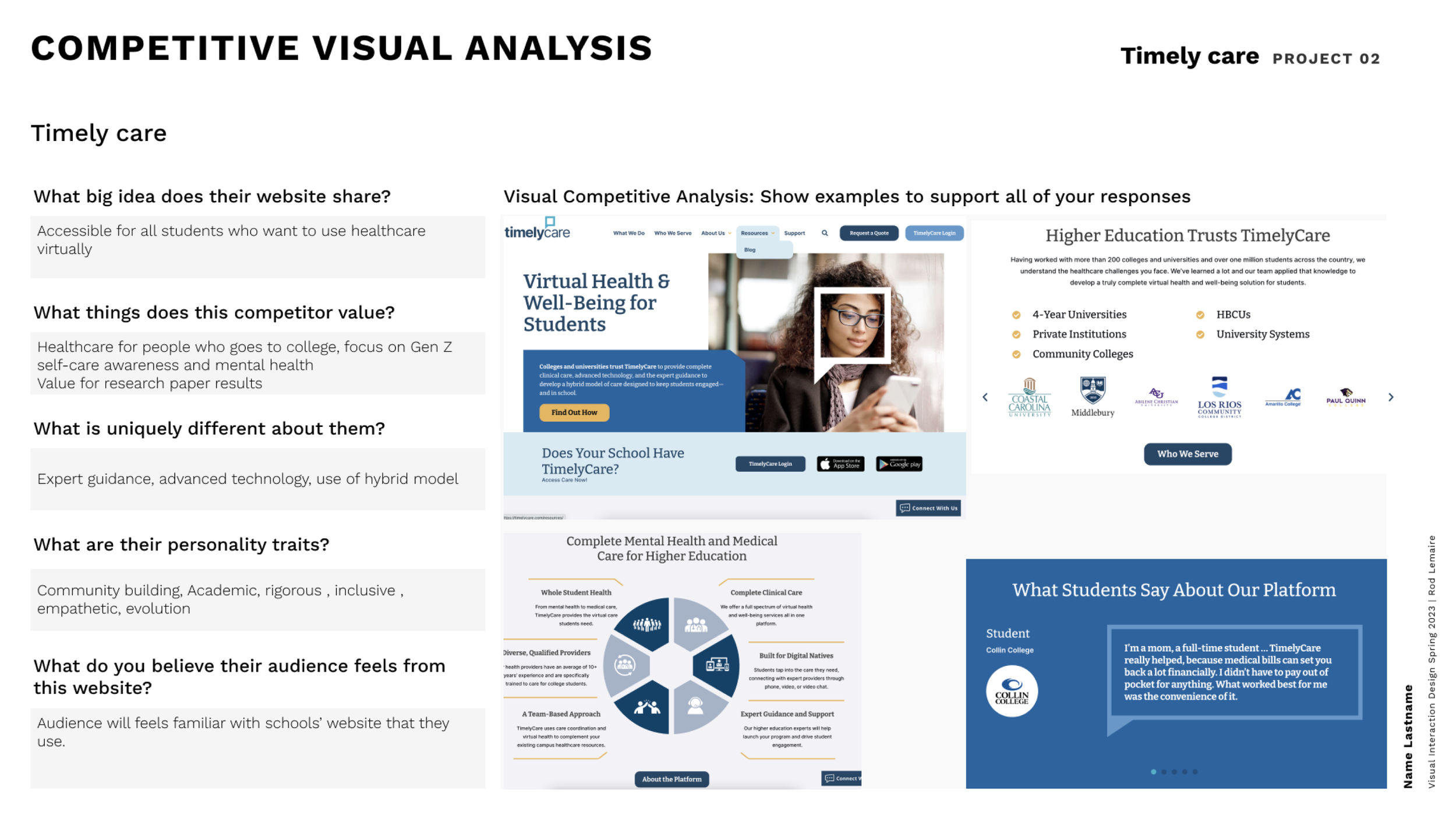
My first step began with competitive analysis, where I delved into the core values, style, target audience, and unique selling points of three different brands. Through this detailed competitor analysis, I created a brand positioning matrix to visually display the market position of each brand.
At the same time, this provided invaluable insights for determining the optimal positioning for HealthWins, ensuring it stands out in a competitive market.

Based on the discovery that gestures are diverse and often align with verbal content and emotional states, the designed gestures for the app should be universally understandable and applicable to all users.

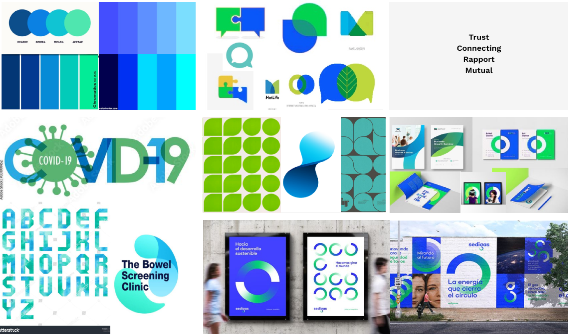
Moodboard Explore
In exploring potential moodboards for my brand, I began by selecting a series of keywords based on my brand philosophy and market positioning, aiming to convey these core messages through our brand style.
Subsequently, I categorized these words into three main groups to create three distinctly different moodboards.

Moodboard 1
Moodboard 2
The first moodboard centers around the keywords "approachability" "warm-heartedness" "friendly" and "comfortable." This segment aims to create a warm and accessible brand atmosphere, making users feel welcomed and at home.
The second moodboard focuses on "trust" "connection" "rapport" and "mutuality" as its core keywords. This section emphasizes building trust and connection with users, highlighting the importance of a positive relationship and mutual understanding between both parties.
The third mood board includes keywords "inspire" "energetic" and "motivate" This segment is designed to energize and inspire our target audience of college students, encouraging them to pursue their goals with vigor, thereby reflecting the brand's inspiring and dynamic side.

My Final Choice - Moodboard 3
I ultimately chose Moodboard 3 because it perfectly aligns with our target user group—college students. College students symbolize vibrancy and energy, and Mood Board 3, with its selection of colors and elements like graffiti and explosive patterns, accurately conveys these characteristics. These design elements not only capture the unique atmosphere and mindset of the college student demographic but also reflect their love for novelty, creativity, and self-expression. Through Mood Board 3, I aimed to create a brand image that resonates with the lifestyle and values of college students, thereby better attracting and connecting with our target audience.
Exploring different brand mood boards taught me how to express brand emotions and values through visual elements. I realized the importance of color, imagery, and layout, and their role in establishing brand identity and attracting the target audience. This process deepened my understanding of creating a brand visual language that resonates with people.

LOGO Explore
The brand logo is key to brand recognition, reflecting the brand's values and personality, and establishing an emotional connection with consumers through its unique design. It symbolizes the brand's professional image, enhances market recognition, and helps the brand stand out in competition.
In the process of exploring brand logo designs, I employed a unique brainstorming technique. I envisioned a multitude of different styles, and allocated 2 minutes to each style. During this brief period, I engaged in rapid sketching, aiming to uncover as many creative possibilities as possible. This approach not only expedited the creative process but also led me to discover a range of unique and potential logo design ideas.


After selecting three promising logo design proposals, I applied the same brainstorming technique once again. This approach significantly aided me in finalizing the designs for these three versions. Through this process, I not only deepened my understanding of each design concept but also ensured the diversity and innovation of the final styles.

Final Brand Logo


The final logo I selected is inspired by the form of a tree, symbolizing the vitality and exuberance of college students, much like the tree itself. The design subtly morphs into the shape of a person, representing growth and development. At the apex of the tree, I ingeniously incorporated a heart, adding visual appeal and profoundly conveying our brand's core philosophy of focusing on and caring for our users. This design aims to communicate a positive and hopeful outlook on life, emphasizing our brand's primary mission—to provide support and care throughout our users' growth journey. With this symbolically rich logo, we aspire to inspire our users to explore, grow, and thrive in the soil of life, just like a tree.
Through the process of designing the brand logo, I learned the importance of symbolism and simplicity in conveying complex ideas.
Wireframes
While designing wireframes for the brand's website and app, I sketched out a variety of different wireframe styles to find the most suitable design. This approach allowed me to explore design possibilities from multiple perspectives, ensuring that the final choice not only meets user needs but also reflects the brand's characteristics.

Explore Process - Website
The final version of the wireframe I produced accurately showcases the brand's key highlights. This design carefully emphasizes the brand's most attractive features, ensuring that users can instantly appreciate the unique charm of the brand.

Explore Process - Mobile App
The final version of the mobile app wireframe I developed offers our users an intuitive and user-friendly interface, enabling them to effortlessly fulfill their needs, such as booking appointments with the nearest doctor and tracking their daily health metrics. This design not only reflects the brand's characteristics but also significantly enhances the user experience.
In designing wireframes, I learned the importance of details for user experience. Continuous refining led to designs that balanced brand identity with user needs, emphasizing simplicity and intuition. The final wireframes effectively showcased the brand and enhanced user interaction, highlighting the value of iterative design.
Final Screens
This is the final version of the website I designed for Health Wins.
On this site, I opted for a background of deep purple across large areas because deep purple conveys a sense of trustworthiness.
At the same time, I incorporated bright yellow, rose pink, and cyan in every image and section to add decorative elements that better reflect our brand's energy. Specifically, in the "Lifestyle," "Urgent," and "Book Now" sections, I chose a more youthful font and used bright yellow to highlight our brand philosophy.
In the section displaying comments from other users about our brand, we deliberately chose a style of photography distinctly different from the serious ID photos used by other brands, to showcase our brand's uniqueness and approachability.


Final Screen - Website Details

Final Screen - Mobile App Details
In designing the mobile app, I applied a similar strategy to the website, carefully selecting colors and fonts to reflect the brand's identity. The background of deep purple conveys trustworthiness, while bright yellow, rose pink, and cyan add vibrancy. Key functions like user interaction and booking services use youthful and eye-catching fonts to engage users.
Through this design process, I've deeply understood the importance of strategic design choices in conveying a brand's identity and values. Moreover, adopting a unique visual approach, especially for user testimonials, showed me the value of authenticity and approachability in establishing a brand's unique image. This journey has reinforced the idea that every design element must work in harmony to create a cohesive user experience, strengthening the brand's connection with its audience.

Brand Promotion
When creating promotional posters for the brand, my focus was on how to showcase the brand's tone while immediately capturing the attention of our target audience. I maintained the style consistent with the brand's website and app, and minimized the use of text on the posters, favoring visual elements instead.
This approach not only ensured consistency in the brand's image but also effectively conveyed the brand's message through clear and powerful visual communication, ensuring that viewers could instantly perceive the unique charm and value proposition of the brand. Through this carefully designed visual strategy, our promotional posters aim to instantly catch the eye of the target audience, sparking their interest and encouraging further engagement.


Brand Style Guide
At the project's conclusion, I compiled a comprehensive Brand Style Guide, establishing clear standards for the brand's visual design and verbal communication. This guide covers elements like color schemes, typography, logo usage, and ensures consistency across various platforms. It also defines the brand's voice, including tone and word choice, to maintain uniformity in all brand content. This guide is essential for preserving the brand's consistency and recognizability, ensuring every brand communication accurately reflects its core values and personality.
Final Thoughts
In this project, I realized that establishing a clear and consistent brand identity is crucial for building brand recognition. Throughout the web design process, I strived to make it both user-friendly and visually appealing, ensuring it intuitively conveyed my brand values and core ideas. As for poster design, I understood the importance of incorporating a prominent element that quickly captures people's attention, making them stop and take notice. This principle guided me to create materials that are not only eye-catching but also resonate with the audience, ensuring they accurately reflect the essence of the brand. These reflections have solidified my core philosophy on brand building—the significance of clarity, consistency, and visual allure in establishing a strong and recognizable brand image.